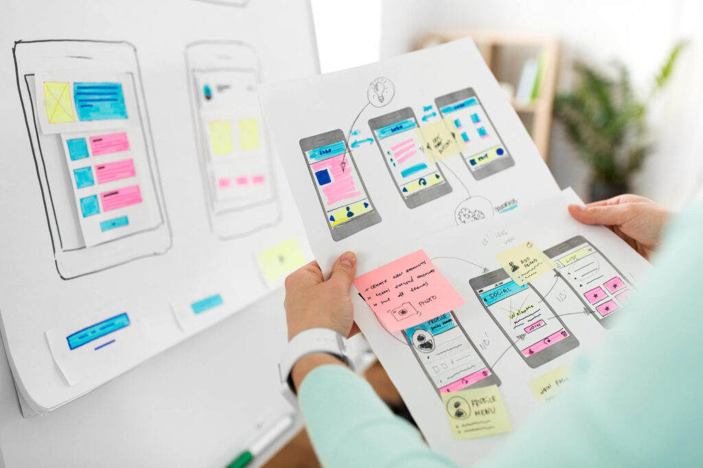
We have formulated the wireframing and design processes in our studio from years of experience with a wide variety of clients and an even wider set of topics. We place emphasis on the psychological thought processes of a system’s user, in combination with a user’s decision-making strategy in order to benefit our clients’ business goals.
We usually divide the design processes in the studio into several stages, which differ in their content or order between clients according to their needs:
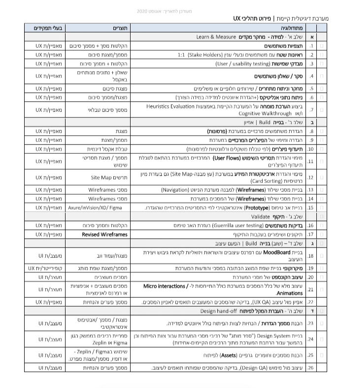
1. Learning and Preliminary Research
We begin the design process by studying the field in depth. As part of the process, we conduct user observations, interview users and stakeholders, and conduct usability tests (if there is an existing system). We dive deeper by using user surveys and questionnaires in which we touch on users’ pain points and we then analyze the findings and derive insights from them. From there, we examine our clients’ competitors in the market — comparing them in a variety of topics related to the user experience. In some cases we will also perform an analysis of relevant analytics and perform an expert evaluation using Heuristics Evaluation and cognitive walkthrough. These methods are designed to locate usability problems for users where there is human-computer interaction, so that they can be addressed as part of the wireframing and design processes. A heuristic evaluation includes a small group of typical users who are exposed to a system and provide feedback according to predefined rules (heuristics). The Cognitive walkthrough method emphasizes specific tasks and the ability of a user who has not encountered a system before to understand and perform a central and simple task.

The deliverables of the ‘Learning and Preliminary Research’ phase

2. Building the Wireframes
At this stage, we define who the main users / personas of the system are, as well as define and map the main features of the system. From there, we create a prioritization hierarchy of these features in relation to their relevance to various users; we define the main usage scenarios in the system according to the prioritization of the various features; and we build a site map using the card sorting method. Only then do we turn to building the skeleton screens (wireframes) of the system. First, we build the various pages according to the system tree and then insert the content into each of the screens. We also create an initial interactive prototype according to the main selected user stories or scenarios.
The deliverables of the ‘Building the Wireframes’ phase
3. Validation of UX Screens
At this stage we examine the prototype we created and conduct user tests within the scope we define in advance. The prototype is an interactive demo where the system can be tested. User tests allow us to validate the quality of the user experience and the ease of use of the system at a relatively early stage, before investing in design and development. We conduct the tests one on one, with one subject and one examiner who records and analyzes the subjects’ actions and reactions. The tests are carried out with emphasis on and attention to navigation processes, calls to action, the ability to complete tasks, as well as prioritization and organization of information. From this stage of the process, we derive insights and improve the system accordingly.

The deliverables of the ‘Validation of UX Screens’ stage

4. Building the Design
In order to draw inspiration, we often build mood boards in which we put design references and visual inspirations towards formulating and creating the UI design. We also characterize the brand language written on the system message screens. From there, we turn to examine , compare, and contrast several system screen design concepts and then select the leading concept, which we then apply to all system screens. Attention is also given to micro-interactions and animations. After that, we conduct internal compatibility tests between the UX screens and the design (UX QA) to ensure that there is indeed compatibility between the UX wireframes logic and the final UI design.
The deliverables of the ‘Building the Design’ phase
5. Working Closely with Development Teams
At this stage, a definitions and guidelines document is created for the development team. A brand book (design system) of the system’s screen components is prepared for the development team as well as later for expanding the system from the existing components in order to produce uniformity in functionality and visibility. We also prepare documents and graphic materials (assets) for development and work closely with developers to make sure that our products are implemented correctly and accurately while being developed. We then perform a design check against the implementation, also known as a design QA.

The deliverables of the ‘Working Closely with Development Teams’ phase
Would you like to hear a little more about our new English checkup service?


