

Most of the work in the SalantID studio revolves round designing complex systems that often run on the desktop only. On average, one in three projects are required to also be responsive for mobile, and sometimes there are even projects with an emphasis on mobile users — either as an exclusive application for the mobile platform or as a primary device for use before the desktop version. Our studio have dedicated experience designing all types of projects and make the adjustments according to the upcoming project. In this article, we will list examples of previous mobile work from the studio and show how working with mobile gives us new and diverse opportunities to deal with different components and adapt them in the best way for mobile devices.
UX screens for the Dan Hotels project
Here we can see the wireframing process of an application for members of the Dan Hotels Club where members can purchase benefits at affordable prices, create and maintain a profile, get answers to questions, get in touch with support, and more.
In these screens, you can see the use of the hamburger menu that opens from the side, a component that characterizes mobile applications because it allows full control of the user in effective navigation between pages.
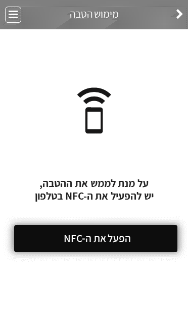
You can also see the use of the capabilities of the phone to create connectivity through the NFC. Smart mobile devices have a variety of tools that can and should be used to upgrade the user experience such as network connectivity (Wi-Fi), location services, Bluetooth connection, use of the camera, flashlight and more.
In addition, a clear information hierarchy must be created with the option of returning to the previous screen and using the division into tabs that will facilitate organizing information in a simple yet clear way. In general, on mobile, visibility should be simplified and the visual load on a user should be lightened in order to emphasize the call to action.
The project page


Designed screens for the Welcome by Gindi project
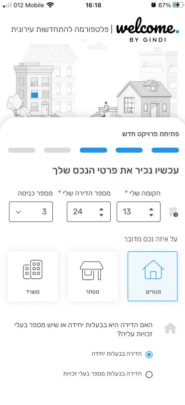
The screens on the right are the mobile screens adapted from desktop screens. In this project, we worked on desktop screens and with responsive design the components were scaled for mobile. The process involved reducing elements on the screen in order to keep the important components more prominent, including the creation of additional hierarchies if necessary.
Here you can see the use of the mobile capabilities of receiving SMS for a one-time connection. Today, many systems tend to connect in this way since it does not require remembering a password, which many tend to forget.
In these screens you can also see the use of form filling fields suitable for mobile where with a quick click, there are different types of form filling elements – choosing between large elements, radio buttons, text field with numbers, dropdowns and more.
In addition, we implemented a useful mobile-friendly mechanism where users see less options in selection fields based on previous responses in a form. Instead of burdening the users with all the fields to fill in, only the relevant fields appear according to the previous answers, so that there is a reduction of the information to which user are exposed.
The project page
Screens designed for the Farmer project
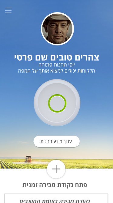
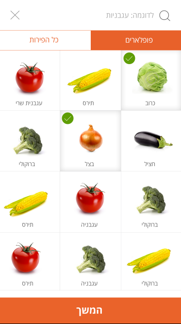
This project was characterized and designed as a mobile application, and only for mobile, therefore the initial emphasis was on mobile components. In mobile design we emphasize the main actions and allow users a minimal number of clicks to perform various actions.
In these screens you can see the cleanliness of the secondary operations and an emphasis on the main operation for the users. In mobile, we place greater emphasis on a user’s intention to perform desired actions and clear the screen of any action or other information that may divert users from performing it.
Also, we try to create significant padding and spacing between components and buttons to avoid mistakes when clicking with the finger pad, which is fatter than clicking with a mouse.
Another important principle in building a mobile system is the use of the components of the system itself – whether it is Android components or iOS components, such as mobile keyboards, error messages, system settings, and much more.
The project page


Screens designed for the CHEQ – Clickcease project
In this project, we worked in a responsive manner on specific screens of dashboards and adapted them for mobile, with the aim of allowing users maximum accessibility and constant monitoring from anywhere of the status of their product. There is a complete and complex theory on how to reduce graphs correctly for mobile, but we will give only a small taste of these principles.
In this project, we created a hierarchy of information that was subdivided in order to produce layers of information that can be seen by drilling down / tapping. After that, we created a scroll of the various dashboard components according to the order of importance of the information and we reduced the graphic components to a more compact appearance, but pleasant and accessible for reading the information, analyzing it, and drawing conclusions from it.


