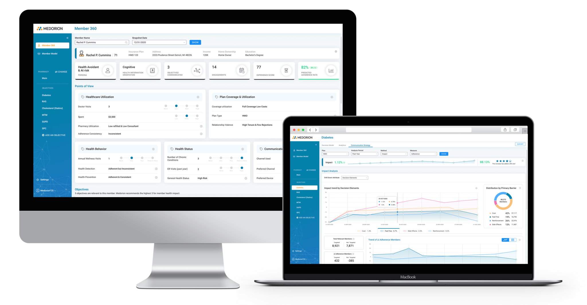
A Platform for Analyzing the Clinical Behavior of Health Insurance Policyholders

Medorion currently allows medical insurance companies to analyze the clinical behavior of the insured and the psychological, environmental and economic motives that drive them in order to better understand their needs, encourage them to perform important tests, produce preventive medicine and create insurance products that are in greater demand.
The uniqueness of the product lies in its ability to predict why policyholders behave in certain ways and to translate these insights into practical steps that influence the policyholder’s behavior. The software developed by the company achieves this by combining artificial intelligence together with advanced tools of behavioral psychology, risk and cost analysis, and is currently widely used by a number of large health insurers in the American market.
-
Company: Medorion
-
Field of Activity: Health-Care
-
Website: www.medorion.com
-
Project: A system for analyzing the clinical behavior of health insurance policyholders
-
Year: 2021
-
Duration: 10 months
Integrated Navigation on Multiple Hierarchy Levels
After entering a certain screen, in order to support multiple levels of hierarchy, horizontal tabs were designed in the screen at the top, while secondary horizontal tabs were placed immediately below. Also, vertical tabs were incorporated on the side in a color that matches the colors of the category. In the field of user experience (UX), this technique/approach is called progressive disclosure.
Impact Analysis Screen for a Particular Strategy
In order to analyze indicators and performance (marketing) of a certain strategy, a screen was characterized and designed that displays a distribution in the format of a partition chart, as well as a set of performance indicators in the format of a rounded port gauge.
Activity / Campaign Planning Screen
Each stage of the campaign receives an expanded view through a removable right side panel which displays the main performance data of the stage. Clicking any step on the list opens the side panel.
Analytical Dashboard
This is one of the main dashboard screens in the system, designed to provide a quick overview of performance according to selected indicators. The dashboard uses a spider/radar chart on the left part, a stacked column graph on the right part, and the bottom part shows achievements by division into categories including statuses.


