


An Application for the Use of Inspectors of the Ministry of Environmental Protection in Field Inspections of Factories

The Ministry of Environmental Protection is a government office in Israel responsible for protecting the environment in Israel whose role is to set national policy, develop strategies, prepare standards, and set priorities for environmental protection as well as enforce the policy through the Green Police, which is the executive arm of the Ministry.
In this project, we accompanied the inspectors of the Ministry of Environmental Protection in their regular work by visiting factories throughout the country, in order to learn their way of working with the aim of giving practical conclusions for upgrading the existing application.
The goal was to go out into the field in order to draw up a preliminary report of findings and come up with conclusions that would lead to an improvement of the user experience in the application. In order to draw up these findings, we met with inspectors who work with the application on a tablet and checked with them what would improve their experience. At the same time we also met inspectors who work with a pen and paper and inquired why they chose this way over the app.
Want to learn more? Click here to read our post expanding on this project.
-
Company: Ministry of the Environment
-
Field of Activity: Supervision of factories
-
Website: gov.il
-
Project: UX research to optimize the inspectors’ work
-
Year: 2017
-
Duration: 3 months

Report Findings
As part of the analysis of the initial information, it can be seen that the types of actions that the inspectors need to perform are divided into five central parts, each with a different weight. As part of the project, we focused on reducing the process of locating and navigating the system as well as the process of entering content into the system, with the aim of reducing them and saving time for inspectors when fulfilling their duties.
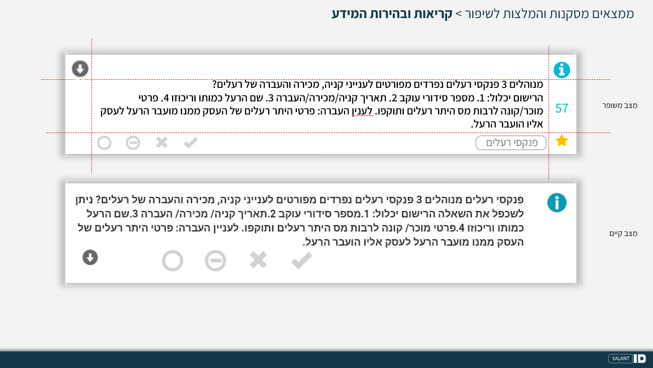
From the report – recommendations for improvement
To improve the user experience and ease of use, we found it necessary to improve the information hierarchy. This is reflected in the small details. For example, note that the pagination of the tab is done in an unclear and inconvenient way. Rearranging the content under a structured grid that divides the screen into a text area and adding related icons helps the user understand a clear hierarchy, so that they can better concentrate on the written content.

Research Conclusions and Next Steps
These screenshots are from the existing system. In the table below you can see the problem, how it affects the user, and how it can be improved, with a rating of improvement effect and development cost. Our research conclusions attempted to guide the ministry to make decisions anchored in the reality of time and money.

