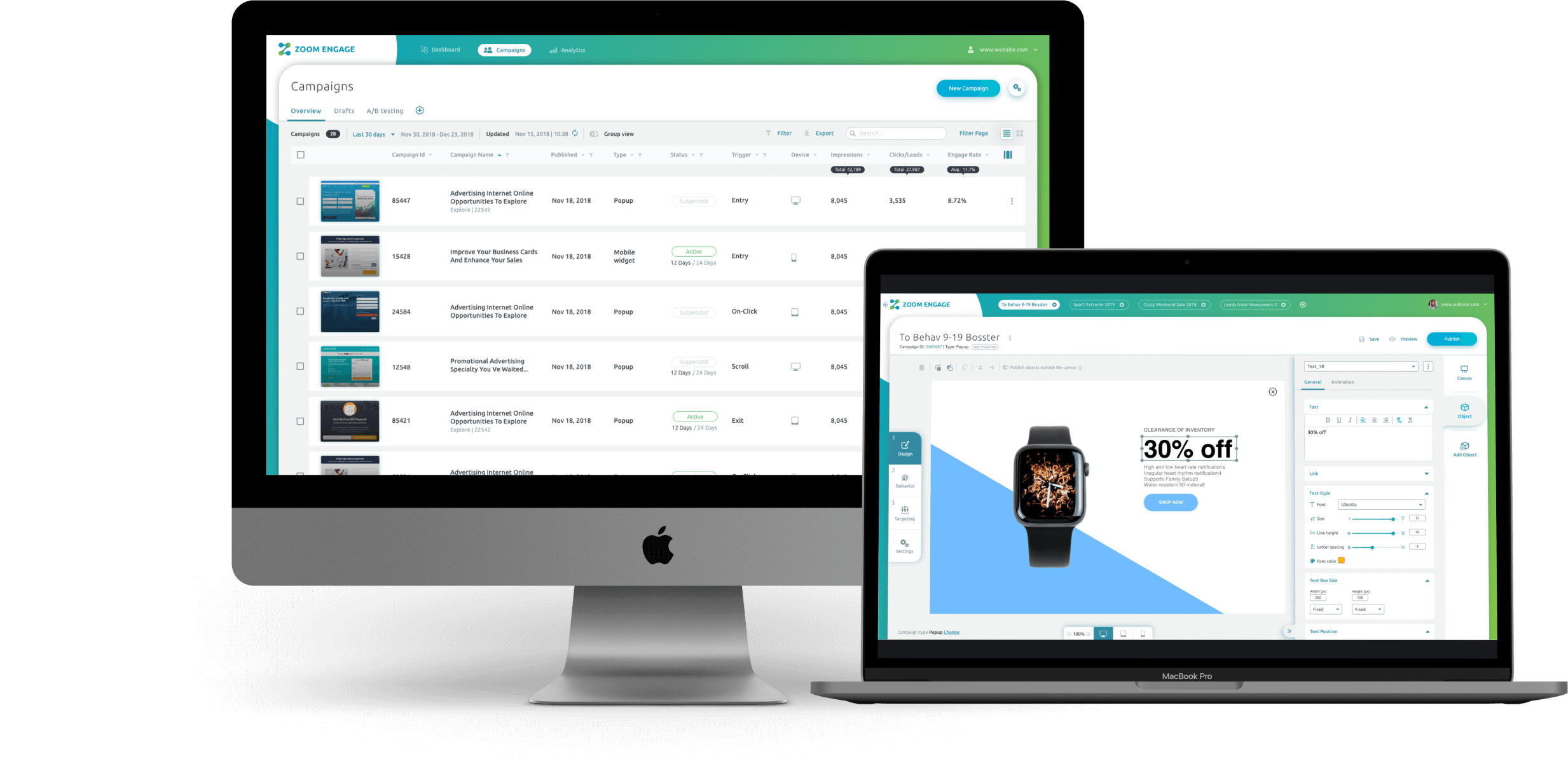
A System for Creating & Managing Internal Campaigns

Zoom Analytics’ product makes it possible to address each website visitor in a unique way according to their characteristics. The campaigns are adapted not only to the visitor, but also to the site itself. Campaigns can be adapted to the type of content (or goods) on the site to produce and optimize different conversion strategies. The campaigns are precisely adjusted to the site, the target audience, and the various visitors to the site – and thus Zoom Analytics manages to significantly increase the conversion rate and the revenue from each visitor. Moreover, the tool allows you to save development costs by making adjustments and changes to the site without the need for a developer.
-
Company: Zoom Analytics (brand Zoom Engage)
-
Field of Activity: Website Personalization and Customization
-
Website: www.zoomengage.com
-
Project: A system for creating and managing internal campaigns on the web
-
Year: 2018
-
Duration: Support throughout the entire product life cycle

Library Rules
There are 30+ built-in rules, such as new/returning visitors, pages visited, geographic location, cookie values, references and more. Users can drag and drop selected rules and insert them into the set of rules in the campaign, which can be edited and removed at any time.
Campaign Settings
There are many campaign settings that can be adjusted, such as targeted output, scrolling down to a specific percentage, scrolling up (recommended mainly for mobile), timer, scanner, and more. The design makes it an intuitive and easy-to-use page through the integration of horizontal cards and the use of icons for easy understanding of the various functions.


Campaign Construction Editor
This page uses drag and drop in a WYSIWYG (what you see is what you get) approach. It uses pre-built modules such as a reverse timer, YouTube videos, forms, I-frames, special effects and more.
New website design
In accordance with the new brand language, and after we finished the characterization and design of most of the new platform, we also made a switch towards the design of the website. The design of the page was pre-adjusted for embedding in WordPress and included a combination of colors and shapes compatible with the brand, as well as a combination of the platform screens along the page when scrolling.


