

Entering an unfamiliar world is a difficult and challenging experience, certainly when it comes to issues that are so far from our everyday life. Each new project that enters the gates of the studio brings with it a complete and fascinating world that slowly finds its way to merge into our lives as user experience researchers and designers. Things we take for granted in our everyday life suddenly take on a much greater meaning, and processes we thought we understood turn out to be much more complicated than we thought. This is even more noticeable when you begin to engage in a project where the main concern is UX research. This was actually the starting point for the research project with ZIM, the leading shipping company in Israel and among the top ten shipping companies in the world.

Learning a field like international container shipping was totally new for our studio, but also as individuals who had never used such services before
Learning a new world
When you approach such a process, you have to come with a lot of modesty – knowing that we have the tools, but the casting of the content is completely in the hands of the customer. The beginning of the process will always start with listening, absorbing information, asking questions, and above all documenting and taking in as much information as possible which will ultimately contribute to a better understanding of the overall system and what is missing in it. Collecting information, customer data, and doing a little digging in to understand how things work and are conducted is crucial at this step.
We knew about ZIM even before entering the research project, but we did not go into the intricacies of the website which contains more than a hundred pages of content and tools. After we gathered the desired background, we turned to map the entire system tree in order to understand what is in front of us. We listed all the topics we want to review according to central topics that touch many pages in the system in a horizontal manner, and from there we began to assign tasks to the staff members. The project took about five intense (but satisfying) weeks.
Real research
First, we checked the site’s performance level in terms of loading times for selected pages, especially the various tool and calculator pages where users have more significant interactions. We tested about five pages in a layout for eight different global IPs (countries where ZIM’s site activity is the highest). In order to understand the relativity of the site’s performance, we compared the performance to parallel pages of five leading competitors in the field.
We applied the competitor comparison throughout all the topics we chose to review. An example of this is the examination of the tools available on ZIM’s website against available competitor tools. We pointed out relevant tools from competitors which are missing on ZIM’s website and also made a comparison between parallel tools with an emphasis on the user experience and the specific components that upgrade the experience.

Performance level tests are especially important when comparing competitors in the field

ZIM’s site in 2022
Emphasis is placed on every step along the way
Another example and relevant to the user experience is the use of the various forms available on the site. Forms tend to be long, and the abandonment rate is therefore high. Therefore, we compared the forms on the ZIM site to the forms of competing sites and made suggestions for changes that would make this step in the process more experiential, and which would ultimately lead to a lower abandonment rate.
In order to also provide a solution to the marketing field on the site, we examined the banners scattered on various pages while referring to the percentage of clicks on them, as well as the accompanying tools on the sides of the page and showed that there are places where they contribute to the user and places that mainly divert his attention.
A little about working with customers
All the work was closely accompanied by ZIM company employees who were there to answer questions and help when needed, a two-way dialogue of ideas and mutual help. A significant part of a job like this is people — that’s the whole idea of improving the user experience. The knowledge of the company’s people, combined with our knowledge as UX experts, allowed us to produce a significant report that is now deployable for tasks in the near and far future to improve and upgrade the existing website.

Mutual cooperation is a necessary component in working with clients
Conclusions
We reached a series of milestones in this project, a process that reflects an orderly and consistent thought in every project we approach:
- Learning the world of relevant content gathered under a lens focused on the goal
- Mapping the screens and coordinating expectations with the client in terms of the depth and breadth of the project as well as in terms of deadlines
- Examining the site’s performance in terms of loading speed and page weight
- Comparing the site to leading competitors while paying attention to the various tools that each site offers
-
Reviewing the forms on the site and examining the user’s experience of them in relation to themselves and in relation to competitors
-
Marketing support regarding the effectiveness of the banners on the site
-
Visual examination of the entire site in order to find non-uniformity
- A flood of innovative ideas that will bring the site to a level above the competition
- Creating an interactive summary presentation that includes all the information collected and the relevant conclusions
Click here for the project page
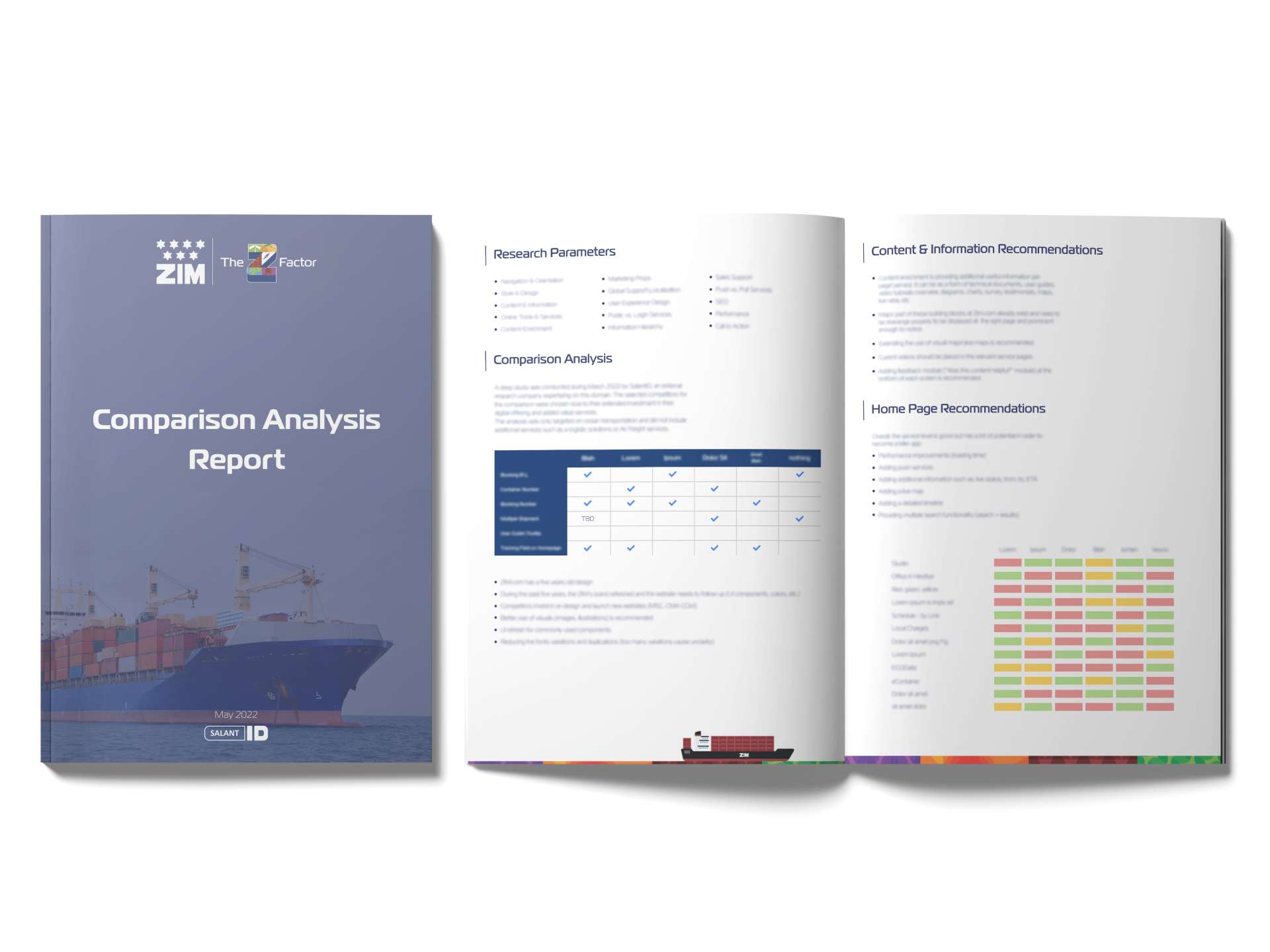
Examples (censored) of products from the research


In order to produce a comparison between Zim’s website and competing companies, we created a wide array of comparisons using various parameters. In the picture on the right you can see a comparison of two parallel axes – the amount of tools provided to users on the site versus the ease of use and their quality. In the picture on the left you can see a comparison in a specific prism of the site – its design level, while giving emphasis according to different parameters. The dark blue color symbolizes the place where ZIM’s site is today in the specific parameter and the light blue color symbolizes the destination to which the site can be improved in a realistic way.

