

Most of our work at the SalantID studio focuses on complex systems, with an emphasis on SaaS (Software as a Service) systems. These systems primarily provide large-scale data which gives users information and insights that they need in order to better understand the current status of their work and act accordingly. Using a dashboard is vital in systems like these since they provide a quick, easy, visual, and often interactive way for users to absorb a lot of information from a high-level view. In this article, we will tell you a little about our studio’s process for crafting dashboards, as well as some best-practices to help teach you how to create your own dashboards.
Complex systems are called complex for a reason. More often than not, as a studio taking on new designs, we encounter a system that requires a moment or two to understand and process what we see before our eyes. A moment to flex our brains, to ask new clients questions about their world which we might not normally know, and to enter the depths of users’ souls and from there bring the design process. One of the screens that requires the most cognitive effort is a dashboard screen.
You are probably asking yourself what these screens are and what they look like. Take the screens below as an example:

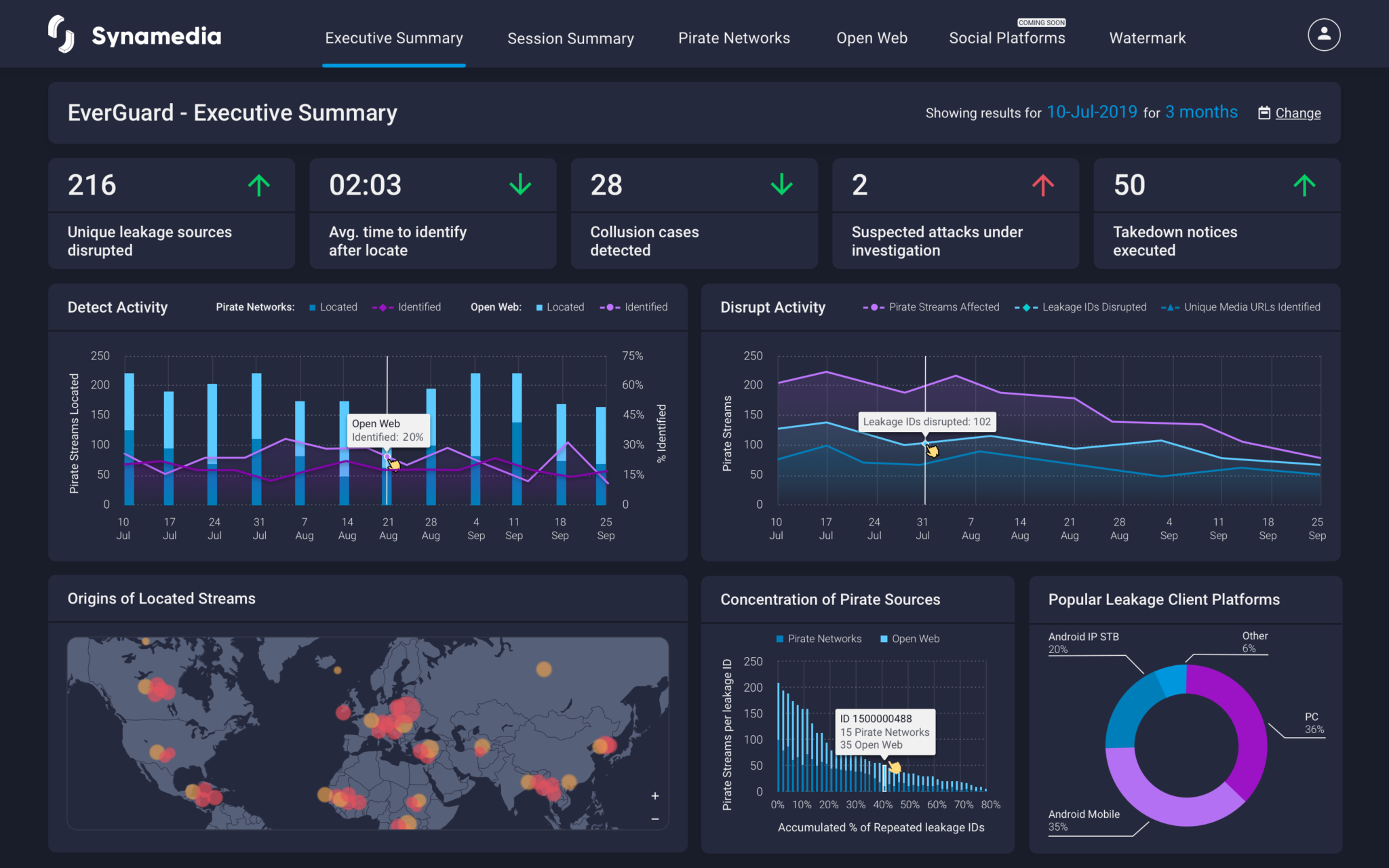

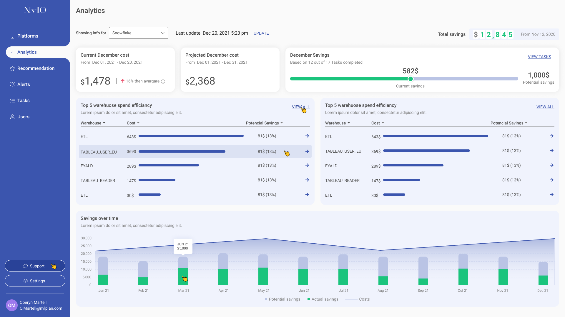
Dashboards in the digital world
As you can see, dashboard screens tend to be very visual, divided into sub-sections within the page with single widgets relaying information or a cross-section of similar widgets providing information on a specific topic. It is basically a large board of information that is constantly updated and provides a broad overview of the data in the system.
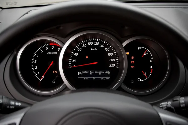
The digital world adopted the concept of a dashboard from a completely different world – the world of vehicles. Everyone who has a car at home — and even those who don’t — has seen or heard of this term. In a car, the dashboard works as a control panel of a vehicle, placed in front of the driver’s eyes, which includes indicators showing live data on the status of the current drive, including metrics such as speed, fuel level, engine status, and more. Just like a car dashboard, digital dashboards also provide status and metrics about the current state of a digital system.
Some relevant concepts
Remember! Not every visual component is a dashboard component. Only components that contribute information about the existing state of a platform can be considered dashboard components. In the field of design, we call them infographic elements – or graphics that provide us with some information. The actual process of translating the information into a visual presentation is called “data visualization” and it requires a lot of attention to detail and a real understanding of a users’ needs. In this process, we as designers take high-level data from throughout a digital platform, break it down into numerical or qualitative data, and translate it into simple-to-understand typography and graphs. Another concept worth knowing is illustration – the use of graphics as a means of illustration. More often than not, data visualization and illustration work hand in hand within a dashboard.
How to present information
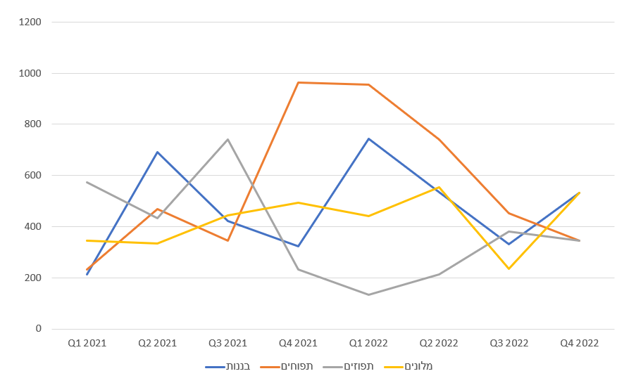
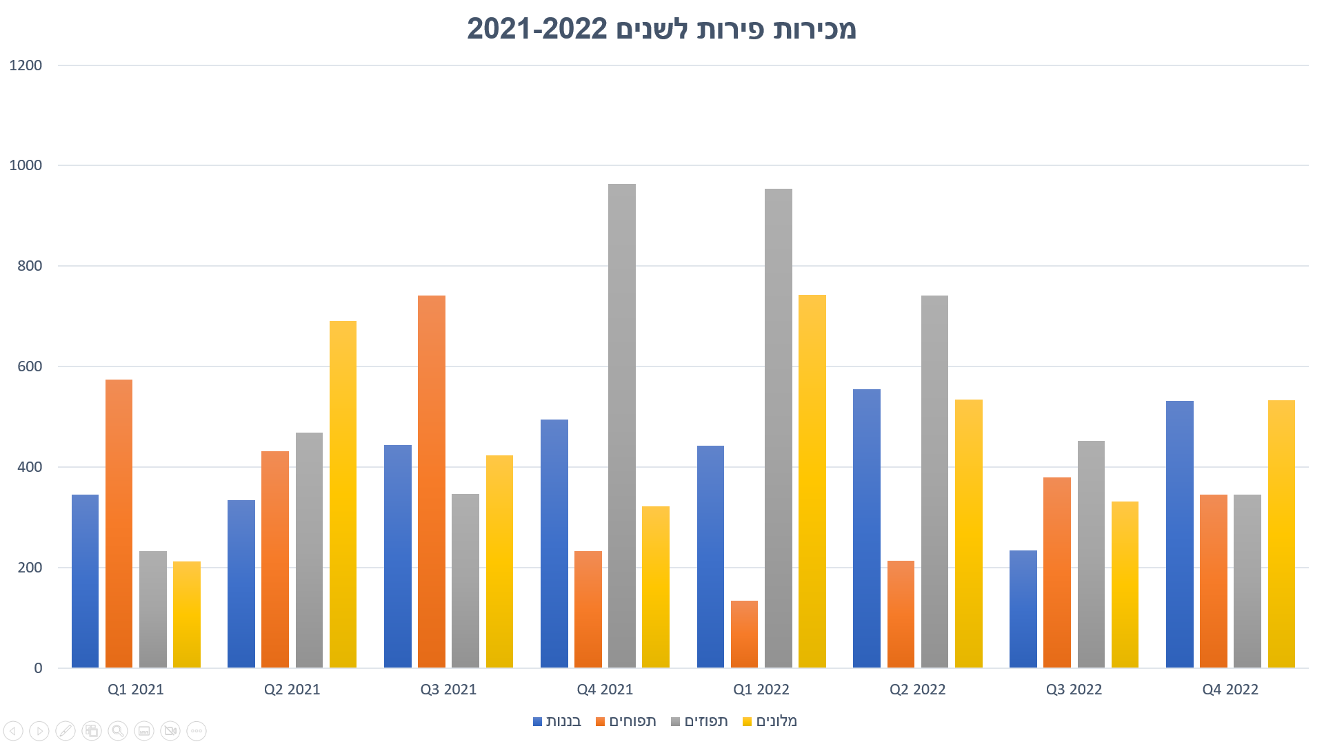
As you can see in the example on the right, there are cases where we have a lot of information that we want to allow users to quickly and easily understand at a glance so that they can act accordingly. The way we present information influences the insights the user gains from the data. For example – in this example, if a user is given a simple table, it will be difficult for them to conclude much from the data, but if the data is displayed as a bar graph, the user will be able to compare identical products between different time periods — or alternatively, they can compare different products within each of the time periods. Moreover, if users are given a graph of trend lines, they will focus on the trend that changes from period to period and will be able to estimate a forecast for the following periods based on analyzing previous trends and understanding the consumer market. Presenting information graphically makes it easier to examine, analyze, and understand data since it’s easy and convenient to read.


Dashboard size and functionality
When designing a dashboard, our first aim is to fit all the data into one screen. Why? There are a few reasons. First, the order and placement of components within a dashboard have great meaning, and often each component or widget relates to the ones around it, so viewing them together can help users understand the big picture easier. Secondly, it should be taken into account that scrolling is not possible in some cases, such as when displaying a dashboard on a television screen.
Types of dashboards
Dashboards can be classified into two main groups — operational and administrative — with a third group being a hybrid of the two. Let’s break down the differences between these three types of dashboards.
Operational Dashboards present information to the user in a quick and clear manner, showing the various sources and their status. The purpose of this dashboard is to convey critical information to the user quickly, guiding them to take action. Imagine this type of dashboard to be a sort of digital management space, designed to help users be active, fast and efficient.
Administrative Dashboards (Analytical Dashboards) provides users with information at a quick glance which enables them to analyze the data and make decisions. This dashboard is less time sensitive and does not focus on the need for immediate action. This way, users can actually take in the data, analyze trends, and make optimal decisions.
Hybrid Dashboards are a combination of the previous two dashboard types. They display quick information for decision-making just like in an administrative dashboard, while simultaneously presenting real-time statuses and specific calls to action similar to an operational dashboard.

Components and colors
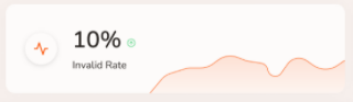
The colors you chose for a dashboard design must be chosen carefully, since they are also of great importance. In our studio, we tend to stick to a company’s brand colors, but will use additional colors such as green, red and orange for data presentation. For example, if there is a company whose dashboard displays financial graphs, we use a green color to indicate a positive trend and a red color for a negative trend. We also use the colors red and orange to alert the user of something they should pay attention to (similar to the use of these colors on a car dashboard – red and orange lights to indicate that something is wrong like to check the engine or that you are low on fuel).
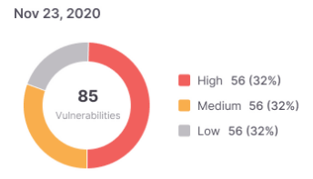
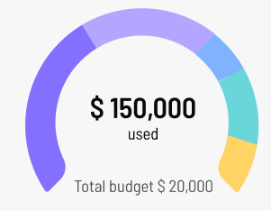
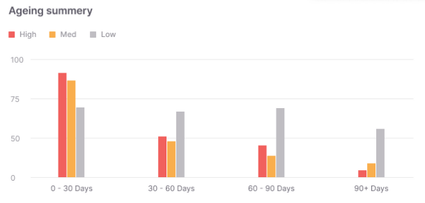
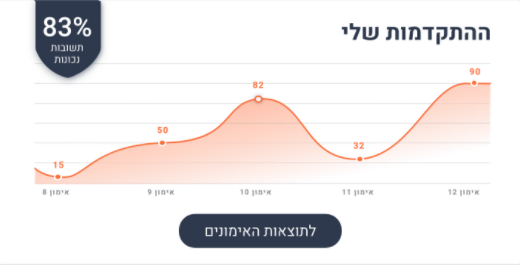
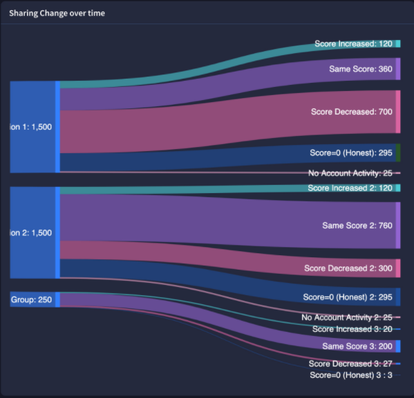
These are the common controls we work with when building dashboards in complex systems. Our goal is to select and match the appropriate graph or control according to the user’s needs and the information that needs to be transferred. Of course there are other many other types and styles of graphs and controls, but we will not elaborate on them in this article. All the examples below are from systems our studio has built in the past.
The SalantID studio has had the pleasure of designing a wide variety of dashboards for different clients and their users:

CHEQ – Clickcease

Synamedia – Cyber

Sapiens

Checkmarx

Skai

Blueribbon

