

When a user experience designer approaches first starts to design a new screen in a system, they immediately encounters the question – what will be the screen size I work on? Or in other words – what screen resolution do I intend to work on? This question is of great importance because it affects the usability of the system. There are a variety of approaches, and each has its advantages and disadvantages. In this article we will review the various approaches prevalent in the world of UX/UI design and conclude by saying that there is no single correct answer, and that each system should be examined individually and the appropriate approach adapted for it, considering the circumstances and the users.
Our “playground”
In any work of an artist, whether it is a painter, product designer, feature or user experience designer, the first decision that needs to be made is what is the “playground” we are playing on. If we compare to the world of sports, for example in the field of football, the size of the field affects the game itself – a player who has to run on a large field will use his strength differently and move less than the radius of his position (so as not to “waste” his running power quickly), unlike a player on a small field who will run much more and will move from the first half of the court to the second and back with each pass of the ball from side to side.
Even in our case, in the world of design, the screen resolution matters – on a small screen there will be less flexibility in the positions of certain components and there will be a higher thought of prioritizing components one on top of the other. An example of this could be the use of the hamburger menu in the transition between desktop and mobile screens – the menu on the desktop can be spread out for the user’s eyes at the top or in a side panel of the screen, but on mobile it will take up too much space at the expense of the content, so it will have to be reduced into an icon that will open it.


Mobile or Desktop First
The issue of different resolutions can be divided into two main categories based on the different types of platforms that are usually worked on – desktop and mobile systems. Working on a tablet is also taken into account, but it is seen as an intermediate step, and only if it is directly intended for work on this platform, we will take it into account in our designs (otherwise we will simply create responsive screens that will automatically shrink and adapt to the screen size). Within each of these categories there is another division according to device size, but we will refer to this division at a later stage in the article.
The question of mobile or desktop first preoccupies many designers because it affects the product at the end of the day. In order to determine which platform we will work on first, we will usually ask the question on which platform most users currently work. Second, we will examine the complexity of the screens. Usually if screens will be at a high level of complexity, we will want to “crack” them first on desktop screens because they allow more flexibility in our thinking and optimization as UX and UI designers. It is much easier in complex cases to open everything on the table and only at a later stage to reduce and compress content in an organized and convenient way. Because the emphasis in our studio is on SaaS systems, which are complex systems in which users can perform a variety of operations without the need for an accompanying representative, we will almost always turn to working on desktop screens first.
5 resolutions for designing management systems and websites
Now that we have passed the first stage and decided which platform to work on, we next will start working on designing on one screen resolutio. We at the studio by default tend to work on screens with a size of 1920 x 1080 pixels (equivalent to a 15-17″ screen), out of convenience, unless our customers request otherwise or if the needs of our users are different (for example in East Asian countries most computer screens are smaller).
After we work on all the system screens in one screen size, we then demonstrate a selection of about 2-5 of those screens using different resolutions depending on the customer’s requirement. Those other screen sizes/resolutions include:
**1920 x 1080 (15-17″ screens)
*1600 x 900 (14″ screen)
*1366 x 768 (13″ screen)
*1280 x 720 (11″ screen)
*2560 x 1440 (27″ screen and 4K screens)
These sizes reflect the common resolutions on the market today. The first four sizes should be responsive. What is responsive you ask? Responsive design makes it possible to create a match between the pages and the various elements displayed and different screen displays, whether it is a desktop, computer, tablet or your mobile phone. This process is made possible through flexible code that contains display settings for different screen resolutions, depending on the platform the user uses.

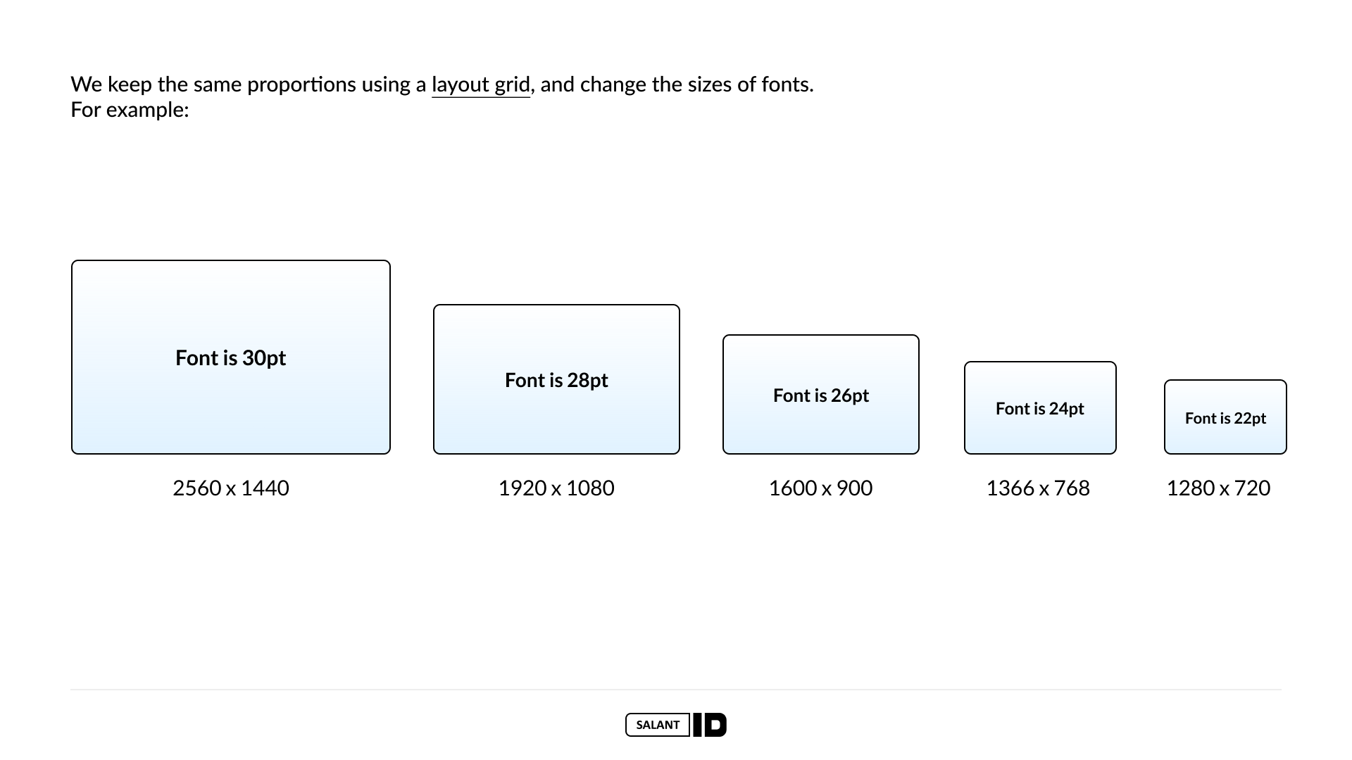
Maintaining relativity
Here in the example you can see how we keep font sizes in relation to the screen size. On a larger screen we will use a larger font that will relatively decrease as the screen decreases, up to a certain level that may be unreadable or impair the usability of the system. The same is true when we enlarge texts.
This procedure is also true for other components in the system, such as the grid system we work on. The grid will decrease proportionally as the screen size decreases and increase in the same way.
See some examples of screen resolutions via management systems that our studio characterized and designed:


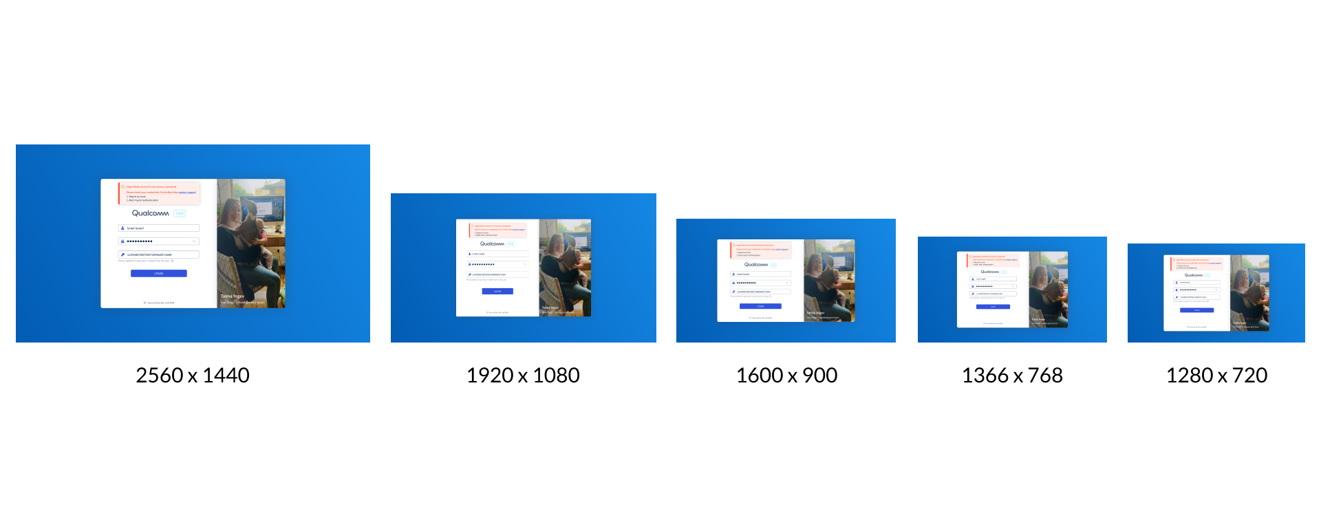

In a complex system project for the Qualcomm company, we created designs using five different screen resolutions. You can see in the examples above the differences between the different sizes.
For example, examine the change in font size in the navigation menu of the Dashboard component as the screen resolution changes:
- At a resolution of 2560 x 1440 the font size is 14px
- At 1920 x 1080 resolution the font size is 12px
- At 1600 x 900 resolution the font size is 12px
- At 1366 x 768 resolution the font size is 10px
- At 1280 x 720 resolution the font size is 10px
As you can see, never use font sizes below 10px font because this makes text unreadable and actually hinders the overall user experience.
Want to learn more about this project? Go to the project page


In our project with Skai, we worked on the central dashboard column and created designs for three screen sizes.
In the largest resolution of the three (1920 x 1080) you can see that the text line “partly cloudy skies” appears next to the graphs and in the other resolutions (1366 x 768 and 1280 x 720) this text appears above the graphs. This move is intended to allow the graphs their central place at the desired size in order not to harm users’ ability to read data from them.
Want to learn more about this project? Go to the project page


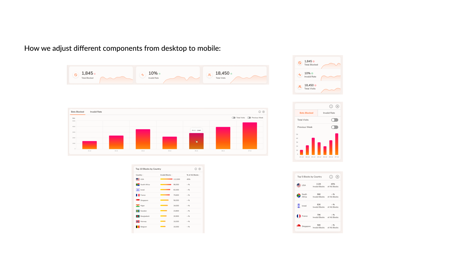
In the CHEQ company’s project on the product Clickcease, we first worked on the desktop version and then turned to mobile design.
The transition between the various components can be seen in the graphs that have been reduced in width, in the location of the tabs and filters, in the visual reduction of the tables and in the amount of data displayed. In this system we had to discuss the importance of the displayed information and its prioritization in order to reduce information overload.
Want to learn more about this project? Go to the project page


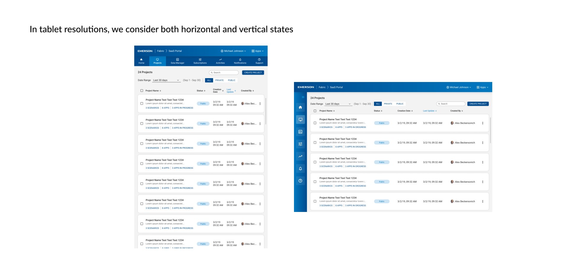
In our project with the Emerson company, we first worked on the desktop version and then we also applied to adapt it to the resolution of a tablet.
On a tablet, it is very important to characterize the system by holding the tablet in both horizontal and vertical modes, since on a tablet, users are more likely to play back and forth between the different modes. A tablet is an intermediate step between design for desktop and design for mobile, so even when characterizing this resolution, it is important to prioritize the various components in the system and think about what to expose first and what can be “folded” inside the system.
For example, you can see the change in the navigation menu between the vertical mode of the tablet (top navigation menu) and its horizontal mode (side navigation menu).

